SSEMBLE
OVERVIEW
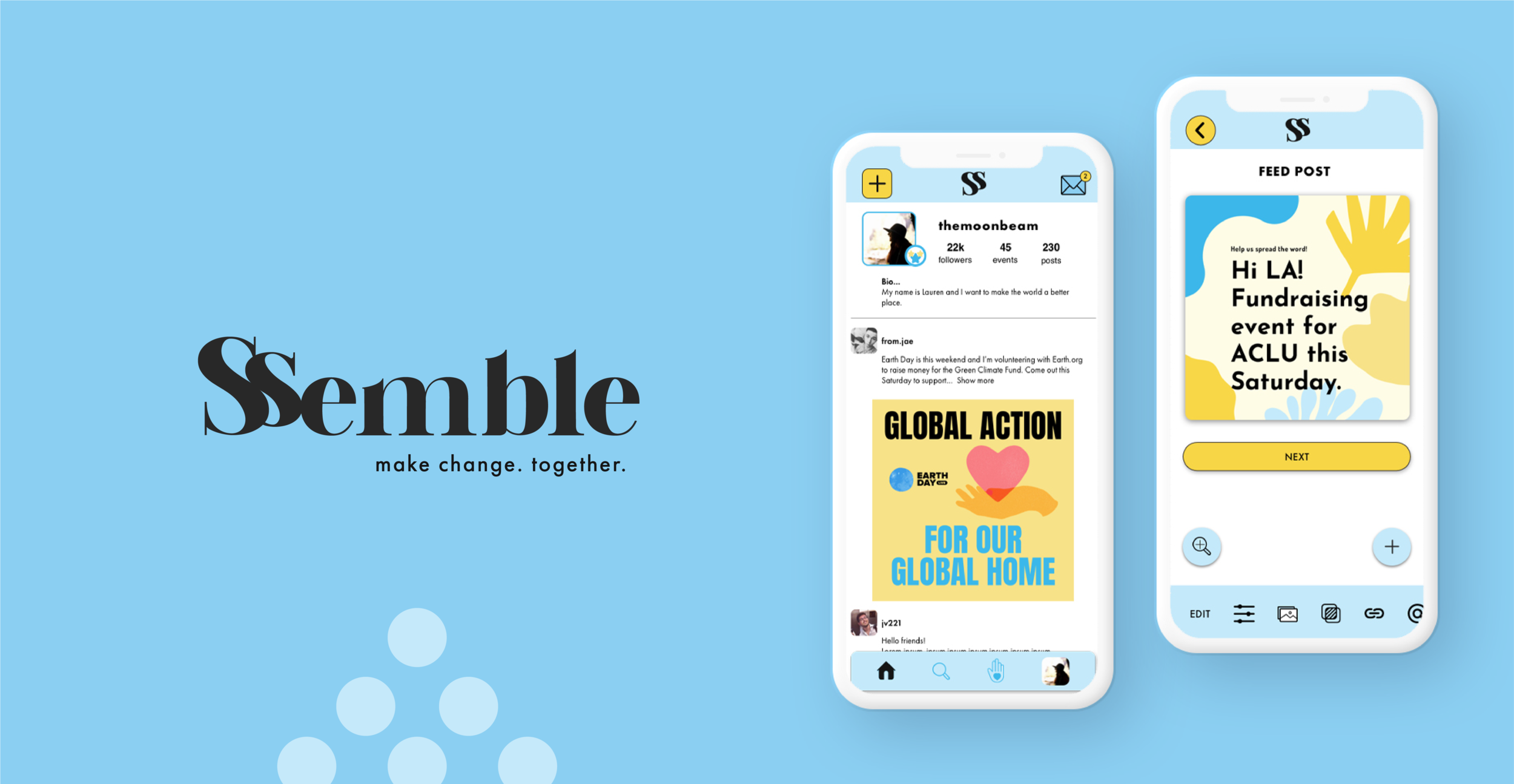
Ssemble is a social media platform that helps people engage meaningfully with causes and organizations they care about the most.
It connects people who care about the same things and gives them the ability to organize, coming together to make realistic and impactful change in their communities.
This is a personal and conceptual project I completed as a part of my coursework for Springboard.
ROLE
Product Designer
Product Strategy, User Research, Interaction, Wireframing, Visual Design, Prototyping & Testing
DURATION
4 weeks
BACKGROUND & RESEARCH
The year 2020 had far-reaching impacts that extended throughout the world. America had a national awakening to the realities of persistent and systemic racism. Young people turned to Instagram to voice their support and organize movements in their neighborhoods, keeping their communities updated via live video and posts. The platform, created to stay connected to friends via inspirational and aspirational imagery that eventually evolved into a way for companies to promote products, became the preferred method people chose to spread the word about causes and issues that seemed far more important than what the platform was created for.
It seemed ineffectual for a platform that was created for lighthearted sharing and self promotion to be used to carry important messages on social justice causes. It simply is not built for it. I started imagining a platform that could tailor itself to the ways people wanted to connect with organizers and make meaningful changes in their communities.
RESEARCH
I conducted interviews with 5 different potential users. These were people who were active on Instagram in raising awareness about causes they were interested in. Causes ranged from anti-racism to climate change and kitten rescue. After speaking with them, I discovered the top problems they shared:
Meaningful change is measured by commitment, tangible actions, and donations. Current social media platforms don’t support these types of activities. All action is external, leading users to other sites to complete donations or discover events.
Sites like Instagram promote aesthetics and visuals over meaning and information. There’s a pressure to make posts interesting and “pretty” enough to catch the attention of other users no matter how compelling the information.
Users wanted to participate actively in their community and were interested in finding organizations in their area where they could attend events or donate to.
“You can’t just post your graph or your contact information for the government official, it has to be in a pastel colour palette and have a couple of encouraging GIFs splattered on it.” (Source)
SYNTHESIS
I organized the insights I gathered from these interviews into an affinity map that told a story of the process a user undertakes when engaging in causes on social media.
HEURISTIC ANALYSIS
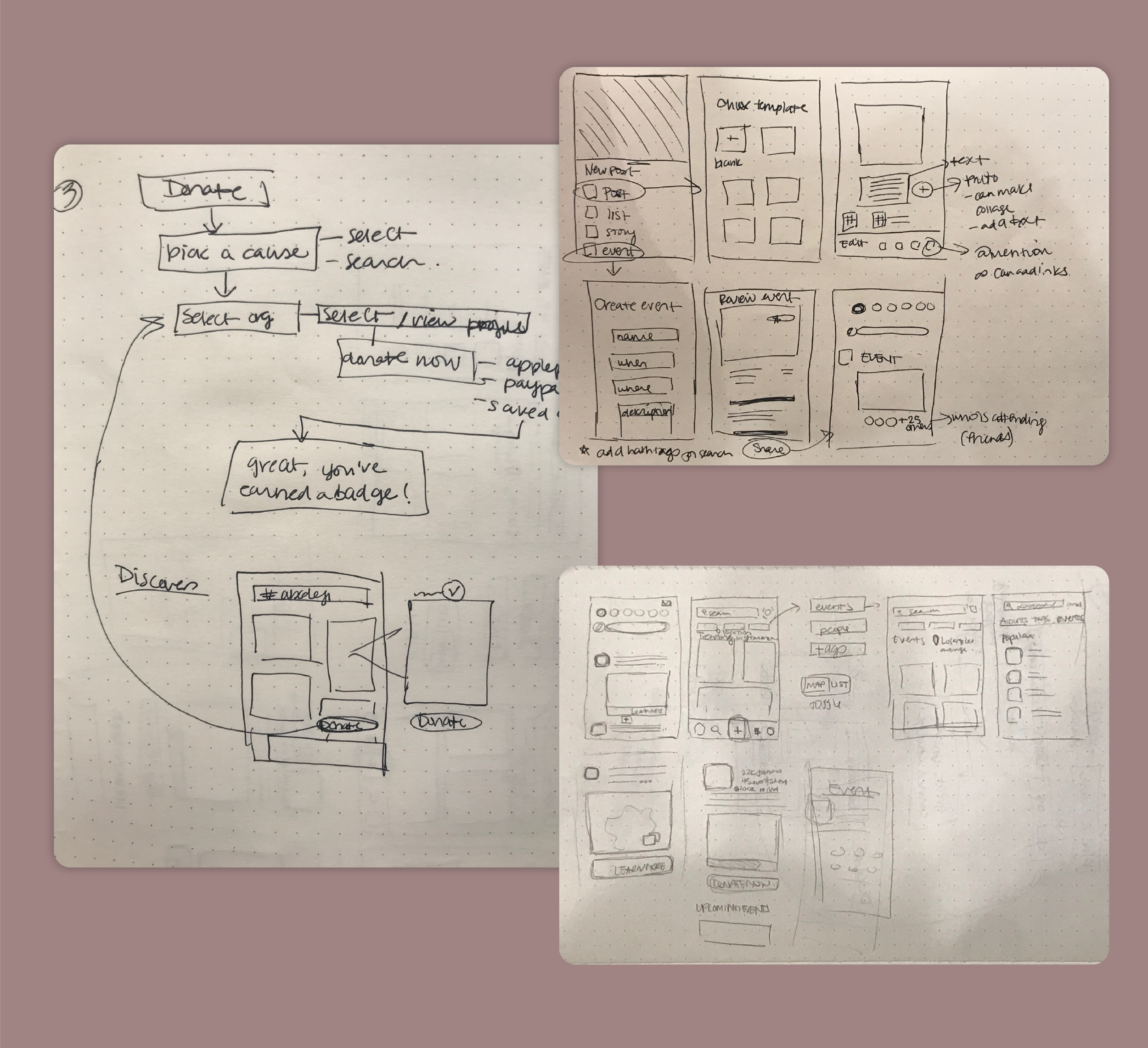
I conducted further research of similar applications - like Meetup, Instagram, Eventbrite, and Facebook - to discover what worked and what didn’t for this context. I knew that this would be a mobile app because of it’s social and spontaneous use nature so I started by making some rough sketches that served to answer the following questions:
How might we connect individual users to larger and local organizers so they can meet new people who share in their passion for causes and so they can engage in actions?
How might we give users the ability to organize events so they can bring awareness to causes, hold peaceful protests and educate their communities?
How might we easily connect users who want to donate money to trustworthy organizations?
IDEATION
SKETCHES
WIREFRAMES
Wireframing is an integral part of the process for me. Laying out the placement of buttons, details and features and testing these things before working on visual design ensures the framework is successful. I created these wireframes using Sketch.
DESIGN & VISUAL LANGUAGE
The Logo & Name
I wanted the name to evoke the idea of organizing. The name Ssemble is a play on the word “assemble”. The brand should connect and mobilize people and groups so assemble was the perfect word. It reflects a sense of togetherness without being aggressive. The icon of the brand is a pyramid of circles - an abstracted view of a crowd of people.
Logo wordmark and icons
The main logo font is bold rounded serif font that conveys a sense of modernism and youthfulness. It is not overly used in the interface and is counter balanced by Futura - a classic and clean font.
Core colors are yellow and blue in various shades. The information users will be dealing with can tend to be heavy and important so I wanted to balance that with a happy yellow and a calming blue to ease feelings of anxiety. These colors also communicate activation and feelings of communication and friendliness.
Color and Typography
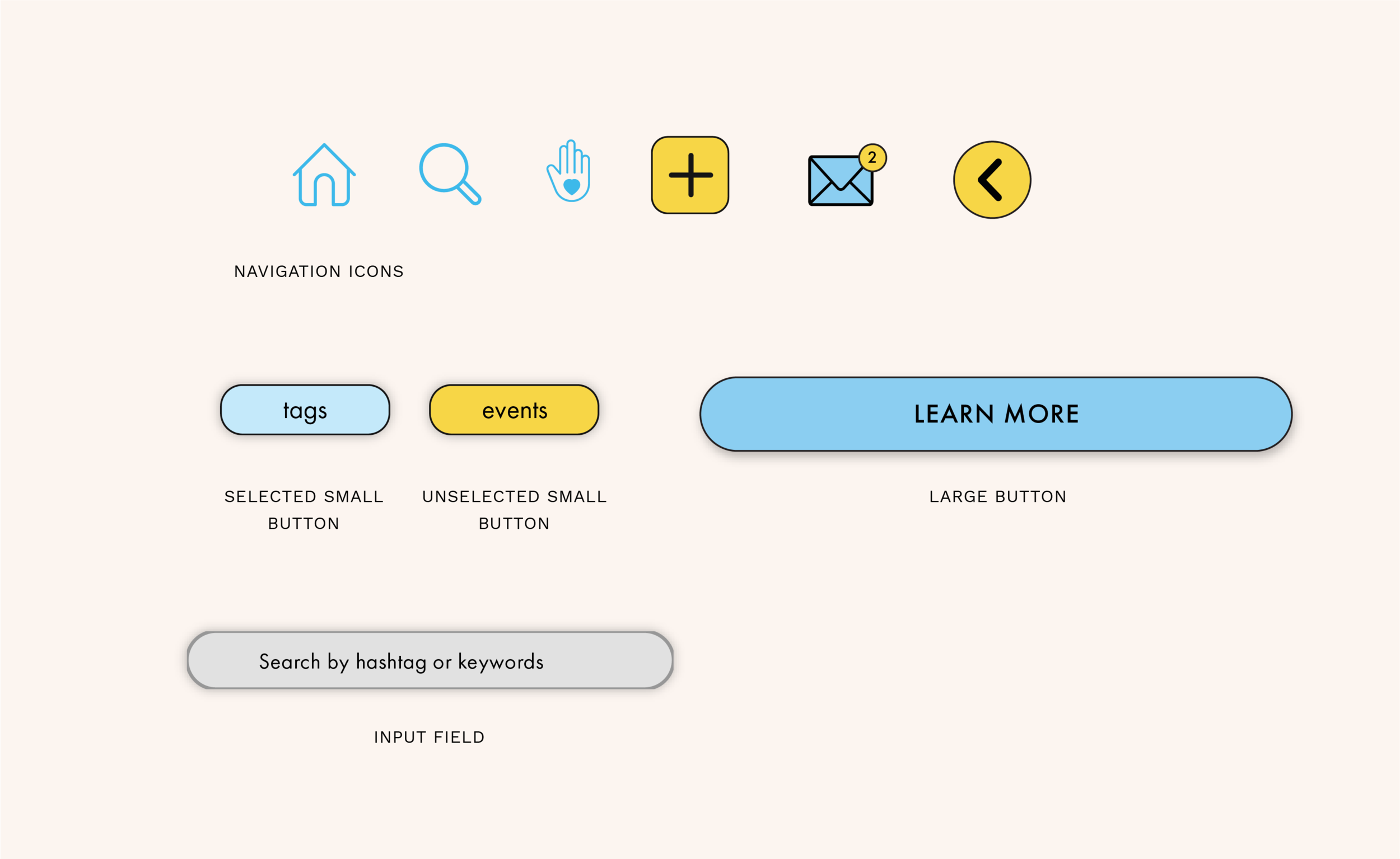
Icons and Buttons
The Prototype
SEARCH & FOLLOW
In order to give users the ability to connect with people and organizers who share the same interests, I designed a search functionality that would allow for searches via hashtags, events, or people. The user can then follow relevant users or hashtag updates. In this way, hashtags can become more useful for the user in finding actionable items.
CREATE NEW POSTS
To create a new post of any kind, users can select from pre-designed templates. They can edit the visuals, colors, text, imagery, and add links and @ mentions. By giving the user templatized formats, they can create visually appealing posts without limitations.
DONATIONS
Donations are one of the ways users feel they can make a real difference. By adding a donate flow within the app itself, we can put these actions at the user’s fingertips. Users can search for organizations to donate to, filter for local organizations, and browse other user and friend created lists of organizations. They can then donate money via Paypal or Apple pay directly within the app.
FINAL PROTOTYPE
Users agreed this platform would make them feel like they were making more meaningful change, which is the goal of the design. Users who were heavily active in social causes felt they would be able to find organizers to follow and participate actively in the causes they were passionate about. Equally, users who are not as active in a hands-on way felt like they would be able to support causes with donations and stay informed with reading lists and sharing of information to raise awareness.
They felt that the way in which hashtags are used within the app made them feel more powerful and useful as opposed to for strictly awareness purposes. And they also felt that there was a camaraderie in posting especially with their friends and liked the ability to share donation lists with their more knowledgeable friends.
NEXT PROJECT: MY MONEY
A modern financial management app


