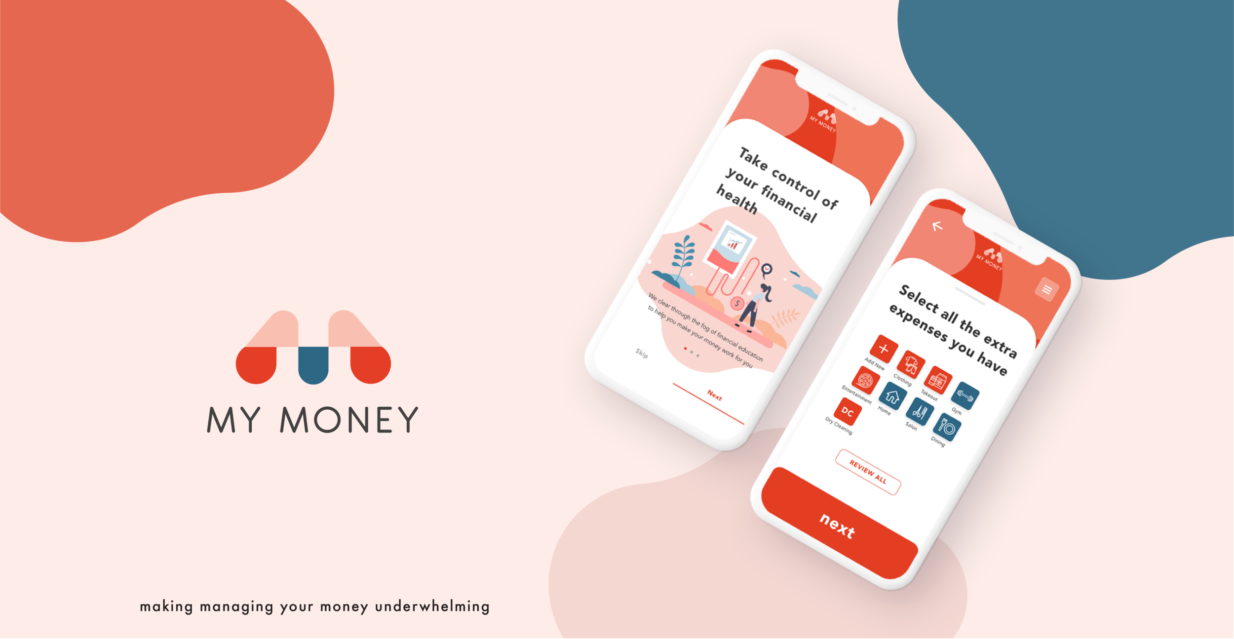
MY MONEY
OVERVIEW
My Money provides a simple and engaging tool for people to take control over their finances no matter how much or how little they have. We provide answers that make the process of money management underwhelming.
This is a personal and conceptual project I completed as a part of my coursework for Springboard.
ROLE
Product Designer
Product Strategy, User Research, Interaction, Wireframing, Visual Design, Prototyping & Testing
DURATION
4 months
EMPATHIZE
PRELIMINARY RESEARCH
My initial hypothesis for this project was that Millennials are not simply “bad at managing money”; it was rather that they had an intense desire to make smarter financial choices but were just overwhelmed and confused. Initial secondary research confirmed this. As Millennials and Gen Z mature into adults, they are often thrust into the world with high debts, no savings, and low income. They were not educated about finance at the times they needed it the most and are now struggling with money management and the complexities of modern finance.

HEURISTIC ANALYSIS

THE COMPETITION
I researched a few different products that provide budgeting systems, money tracking, and financial education. I compared them using the Nielsen Norman Group’s heuristic principles to discover strengths, weaknesses, and gaps within this product space. I formed hypotheses on what features were most useful for younger individuals vs what made more sense for older adults with lots of wealth.
DEFINE
INTERVIEWS
TALKING TO THE USER
Five interviews were conducted with people (M/F - 21-37) at different stages of life and different degrees of financial literacy. My goal was to understand how people managed their money and what their thoughts and feelings were surrounding their experiences. This would help expose the problem areas where this product could really make a difference.
SYNTHESIS
AFFINITY MAP

Through the use of an affinity map, I captured quotes, ideas, thoughts, and feelings onto Post-it notes and grouped them according to key ideas that emerged.
I was able to organize all the feedback into several groupings of topics that would inform my ideation process.
At this stage, I realized how important it was to talk to real end users. While a lot of assumptions I had made ended up being confirmed, there were a few things that surprised me. One was that a lot of the participants, although expressing they would want to talk to a financial advisor also expressed that they would never seek one out on their own and didn’t think they would actually be helpful for them. I kept that in mind as I proceeded to come up with designs for the first iteration of the product.
INTERVIEW INSIGHTS

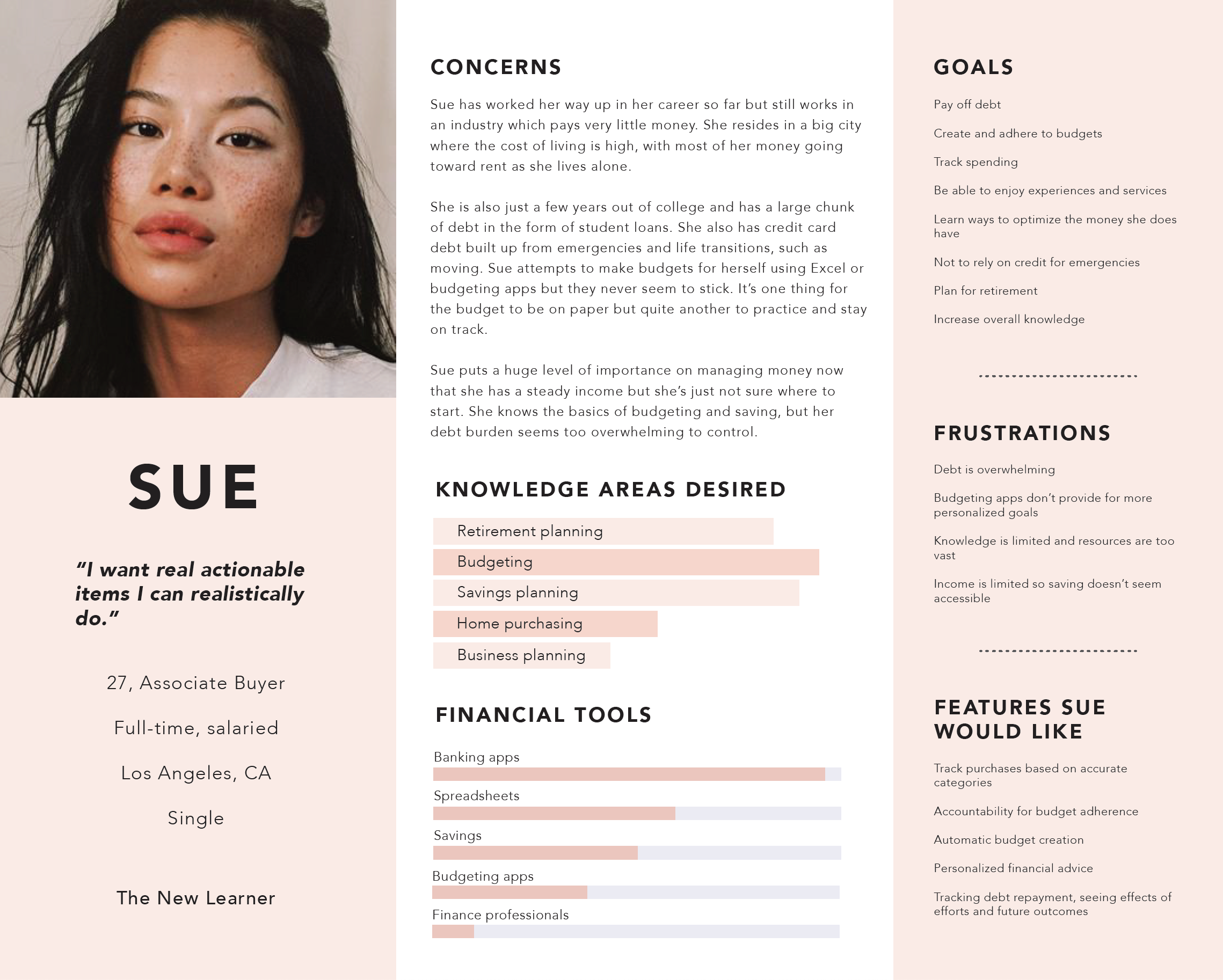
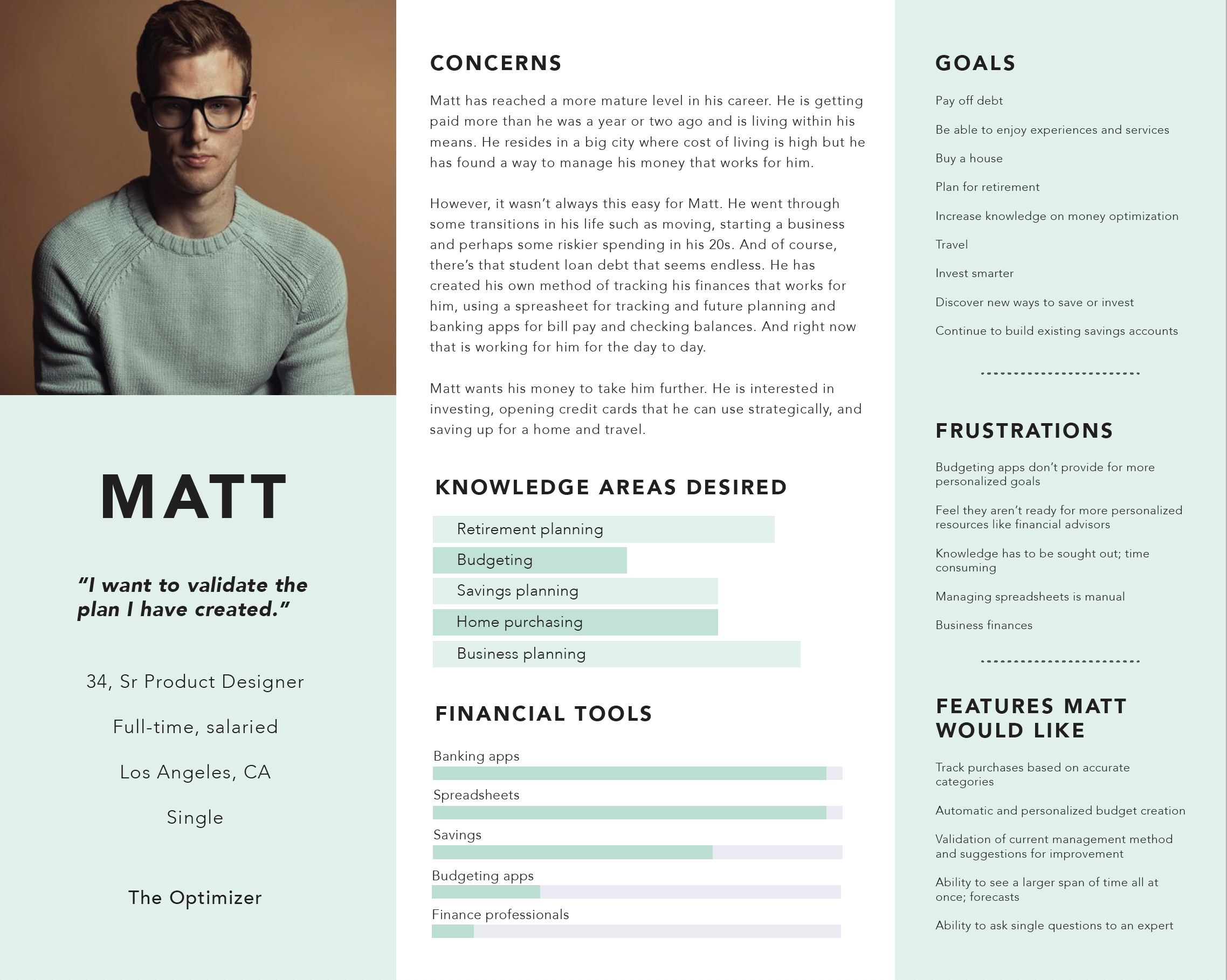
USER PERSONAS
I created user personas based on the data from from interviews. This helped me to define my user. Whenever I felt stuck or had too many ideas, I always referred back to my user personas to make sure what I created would keep their needs in mind first and foremost.
IDEATE
Setting Up Red Routes
From those key insights, I created a list of problem statements that I would solve for in the design. These led me to the red (most important) routes I would create for the MVP.

Create budgets
Track spending

Set savings goals
Provide simple ways to add money to savings accounts

Access resources and targeted informational articles
Talk to specialists users would not otherwise have access to
JOURNEY MAP
In order to understand the paths users should take within the application, I created a user journey that would outline the users thoughts and feelings as they are moving through different tasks to make sure that the app would be supporting their needs every step of the way.


User Flows
I built the user flows for each of my red routes so I could understand each screen the user would need to see in order to complete each task. This helped me to break down the user journey into smaller actions that would translate directly into the user interface. Doing this helped me correct any issues in the flow that could be troublesome if discovered later on.

Ideation Sketches
I began by quickly sketching the ideas that had been simmering in my head for the duration of the preliminary design phases. I wrote notes and sketched small bits of the interface that related to each of the problem statements. This helped inform my next sketches that I would use for testing.

Sketching
I then moved into low-fidelity sketching. Here, I chose the best ideas from my brainstorm sketches and organized them into interface layouts. I decided on button placements and shapes, preliminary language I would use to speak to the user and designed into each of the red routes I set up. I would use these to meet with users for a first round of usability testing.
Prototype

Wireframes
After testing the sketches and finding that they were working well (the elements were placed well so as not to be confusing), I moved on to creating some wireframes with Adobe XD. Wireframing helped immensely with getting every idea out and into the interface. This is where I was able to define my visual patterns and start creating more cohesion between screens. I wrote some initial copy for my screens and started thinking about the iconography and hierarchy of information. These wireframes served as a blueprint for high-fidelity designing later on.

Defining the Visual Language
The Logo & Name
My Money conveys a sense of ownership to young users. It serves as reminder that they can control their financial outcome with learning and dedication. It also lets them know that the app is made for them and not for the benefit of other corporations or services to profit. The logo is a stylized “M” that serves to reinforce the name of the app even when used alone.
Color Palette & Typography
Colors are bright, bold and energizing, conveying a feeling of action. Visuals should have an air of hopefulness and growth, giving the user a feeling of freedom to do the things they love. Communication happens via a whimsical, flat illustration style that conveys genuineness and approachability.

Iconography and Buttons

The Prototype
HOME PAGE

BUDGETING FLOW

SAVINGS PLAN FLOW

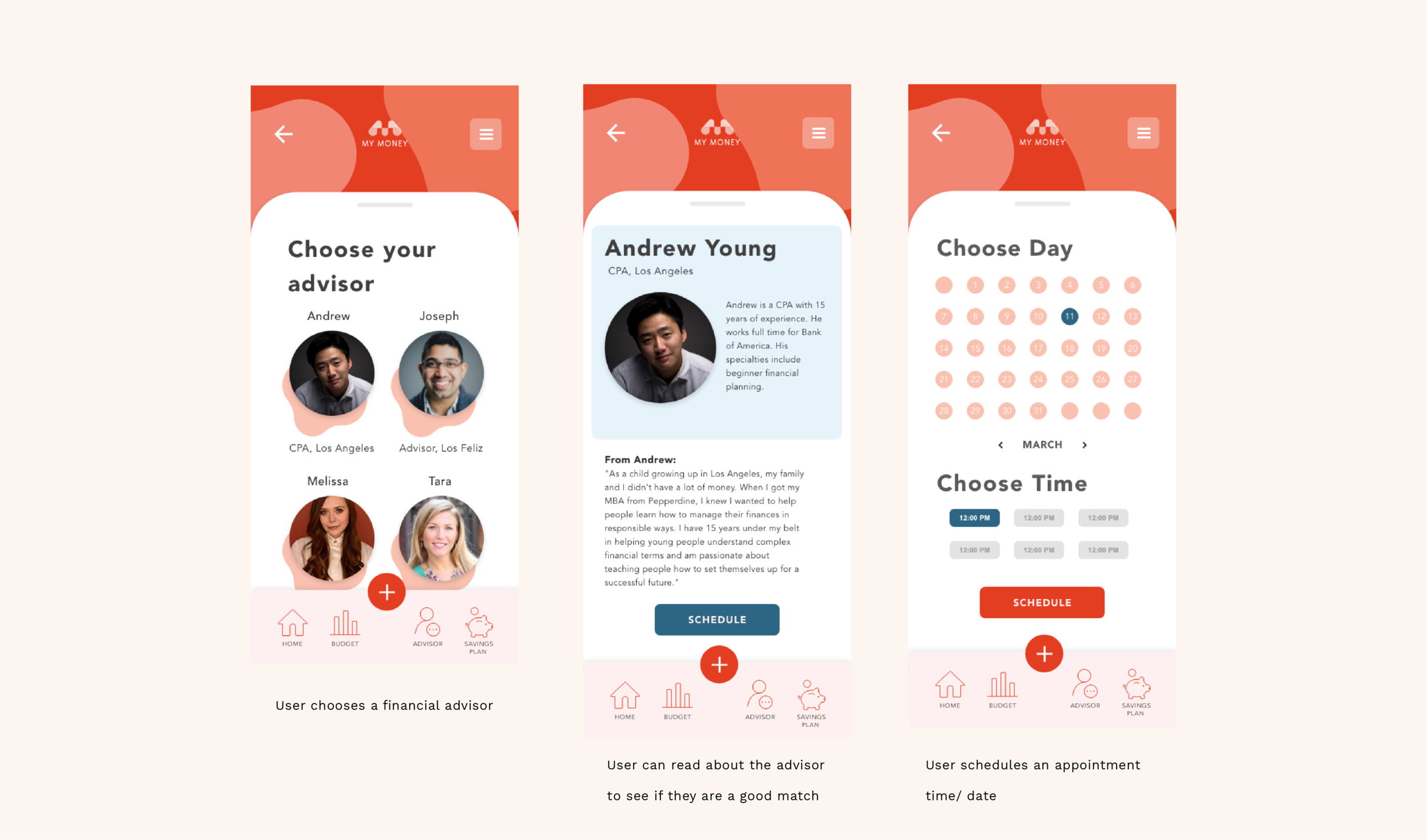
FINANCIAL ADVISING SET UP FLOW
FINAL PROTOTYPE
With My Money, I set out to create a product that made money management more approachable for younger generations. The goal was to create something that was not only easy to use but also provided real solutions to problems facing young people. Not knowing what to do with money turns into seeking a financial advisor who is well-versed in debt repayment and budgeting. Wanting to have more money in savings turns into enrolling in a budget rollover program through the My Money App that turns their unspent budget dollars into real savings. In future versions of this app, I would love to add a rewards system that partners with stores and brands where users currently shop that would allow them to save money on everyday expenses like gas and groceries as well as introduce an investing feature that informs users and gives them resources to invest smartly and speak with investing experts.


NEXT PROJECT: FORMULE
Bespoke skincare e-comm site crafted by a chemist